If you have ever cracked open a cold one and thought, “I could totally star in one of these ads,” you are not alone. The beer poster has gone from a niche craft brewery marketing tool to a full-blown cultural phenomenon, thanks in large part to viral TikTok trends that have racked up hundreds of millions of views. Whether you want to print a custom piece for your home bar, create a promotional poster for your brewery or taproom, or jump on the viral social media challenge, knowing how to make a beer poster from scratch puts you light-years ahead of anyone slapping a stock photo together in five minutes.
This guide covers everything: the best tools, design principles, color psychology, typography rules, photo editing tricks, printing specs, and the cultural moment behind the trend itself. By the end, you will have all the knowledge to produce something that looks like it belongs on the wall of your favorite bar or on a billboard along Route 66.
You Are Watching: How To Make A Beer Poster That Looks Like a Real Ad (Complete Design Guide) Updated 07/2026
Why Beer Posters Have Become a Creative Obsession
Beer advertising has always been about aspiration. From the sun-drenched beaches of Corona commercials to the blue mountains of Coors Light, these brands have mastered the art of selling a feeling. The appeal of a great beer poster goes far beyond the product itself. It taps into summer nostalgia, social identity, and the shared ritual of drinking with people you love.
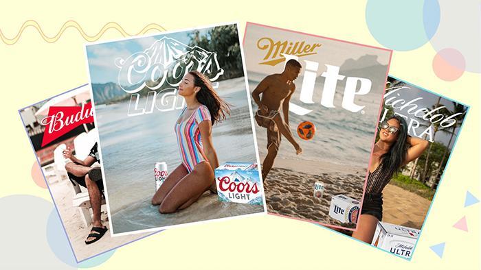
The TikTok Beer Poster Trend turned this into something deeply personal. What started around 2021 as a few creative souls editing themselves into vintage-style beer advertisements exploded into a global phenomenon. The hashtag #beerposter currently sits at over 49,300 posts with a staggering 905.7 million views, while the related #beertime tag has racked up another 675 million views. Within weeks of going viral, the trend accumulated over 50 million views on TikTok alone. People were not just watching. They were participating.
The reason is simple: everyone wants to see themselves in a cool ad. The challenge taps into nostalgia, summer moods, and the aspirational quality of beer branding. It started as gifts, often a partner making a “magazine-style” ad featuring their significant other holding their favorite beer. It quickly spread to everyone from college kids to grandparents.
Understanding the Two Types of Beer Posters
Before diving into the “how,” it helps to understand that beer posters fall into two distinct categories, each requiring a different approach.
Promotional beer posters are created by breweries, bars, taprooms, and marketing teams. They communicate brand identity, product features, and visual appeal. These are the posters hanging on the walls of your local craft brewery, advertising a new double IPA or a Saturday trivia night. They require professional software, high-resolution photography, and print-ready specifications.
Personal or social media beer posters are the kind popularized by TikTok. These are fun, personalized creations where you insert yourself into a beer brand’s aesthetic. You do not need professional design skills for these, just a smartphone and the right app.
Both are valid, both are satisfying, and this guide covers both in full.
Choosing the Right Tool for the Job
The tool you choose makes all the difference between a poster that looks polished and one that looks like a rushed school project. Here is a breakdown of the most popular options.
Adobe Photoshop
Adobe Photoshop CC 2024 remains the gold standard for professional beer poster design. It handles everything from precise background removal to advanced color grading. The learning curve is steeper than other tools, but the level of control it offers is unmatched. For print posters, Photoshop is the clear first choice because it works natively in CMYK color mode at 300 DPI, exactly what commercial printers require. A standard beer poster at 24×36 inches takes about 45 to 60 minutes to complete from scratch in Photoshop once you know your way around the software.
Canva
Canva has become a household name for a reason. It is beginner-friendly, browser-based, and packed with hundreds of beer poster templates covering everything from Oktoberfest to St. Patrick’s Day. If you are promoting a happy hour, pub quiz, or Father’s Day event, Canva lets you pull a template, swap in your logo and photos, and export in minutes. The free tier is surprisingly capable, and Canva Pro (around $15/month) unlocks premium templates, brand kits, and unlimited storage. Canva is best for digital posters and quick social media graphics.
Adobe Express
Adobe Express (formerly Adobe Spark) sits in a sweet spot between Canva’s ease-of-use and Photoshop’s power. It integrates directly with other Adobe Creative Cloud apps, meaning assets you create in Photoshop sync automatically. The free plan includes over 100,000 templates, 1 million Adobe Stock assets, and more than 4,000 fonts. The paid plan starts at $9.99/month, which is notably more affordable than Canva Pro. For beer enthusiasts who also dabble in other creative projects, Adobe Express is worth serious consideration.
PicsArt (For the TikTok Trend)
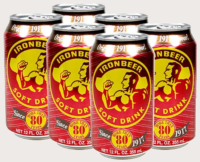
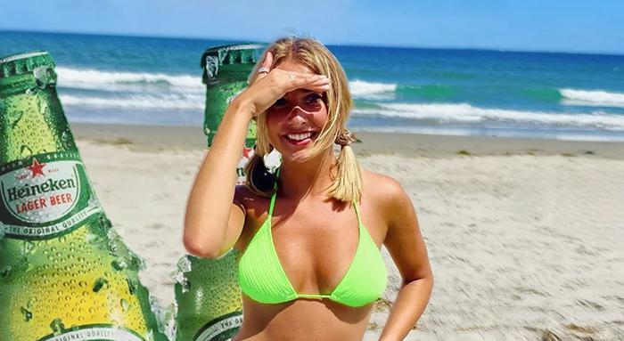
PicsArt is the app most commonly associated with the viral beer poster trend. It is free, mobile-first, and loaded with beer-related stickers, including logos for Corona, Coors Light, Budweiser, Heineken, and dozens more. The process is fast: upload your photo, add the sticker, use the eraser tool to blend it around your image, layer in effects, and export. It was the tool that democratized the trend and made participation accessible to anyone with a smartphone.
Kapwing and Filmora
Kapwing offers browser-based templates specifically built for the beer poster TikTok trend, including ready-to-edit versions for Miller Lite, Coors Light, Budweiser, Michelob Ultra, Busch Light, and Corona. Filmora adds the ability to create beer poster videos, and even includes an AI Text-to-Video feature for those who want to skip the photo entirely and generate the whole thing from a text prompt.
Tool Comparison Table
| Tool | Best For | Skill Level | Cost | Print-Ready |
|---|---|---|---|---|
| Adobe Photoshop | Professional posters, print | Advanced | ~$22/month | Yes (CMYK, 300 DPI) |
| Canva | Events, social media, quick designs | Beginner | Free / $15/month Pro | Limited |
| Adobe Express | Brand-focused, social + print | Beginner to Intermediate | Free / $9.99/month | Yes |
| PicsArt | TikTok trend, mobile editing | Beginner | Free / $11.99/month | No |
| Kapwing | TikTok trend templates | Beginner | Free / $24/month | No |
| GIMP | Budget professional design | Intermediate | Free | Yes |
| Filmora | Beer poster videos | Beginner | Free / $49.99/year | No |
Setting Up Your Canvas: Size and Color Mode
This is where most beginners make irreversible mistakes. Getting the technical setup right before you start designing saves hours of frustration later.
Standard Poster Dimensions
- 24×36 inches: the industry standard for commercial bar or taproom display
- 18×24 inches: works for limited wall space or framed home bar prints
- 11×17 inches: ideal for table tents and promotional handouts
- 1080×1080 pixels: standard for Instagram square posts
- 1200×630 pixels: fits Facebook and web banners
The Critical Color Mode Decision
This is non-negotiable. CMYK (Cyan, Magenta, Yellow, Black) is used for anything going to a physical printer. Commercial printers use ink rather than light, so they need CMYK data. RGB (Red, Green, Blue) is the color system for screens, smartphones, and websites.
If you design in RGB and convert to CMYK at the last minute, your colors will shift, sometimes dramatically. That vibrant amber gold on your screen might print as a muddy brown. Always set your canvas to the correct color mode from the very first click.
Resolution follows the same logic: 300 DPI for print, 72 to 150 DPI for digital. A poster set at 72 DPI will look crisp on a screen but will print blurry and pixelated at full size.
Mastering Color Psychology for Beer Poster Design
Color is not decoration. In beer poster design, color communicates the flavor before anyone reads a single word. Skilled designers know that the right palette can make a viewer’s mouth water before they consciously register what they are looking at.
Color and Beer Style Pairing
Dark backgrounds in deep browns, blacks, and mahogany suit stouts and porters. They evoke richness, roasting, and winter warmth. Think of Guinness’s iconic black-and-gold aesthetic, which has remained essentially unchanged for decades because it works perfectly.
Warm tones in oranges, ambers, and golds are the natural home for IPAs and pale ales. These colors signal citrus, hops, and the glow of a summer afternoon. They trigger associations with bitterness, brightness, and bold flavor.
Read More : Beer With Lowest Alcohol Content Updated 07/2026
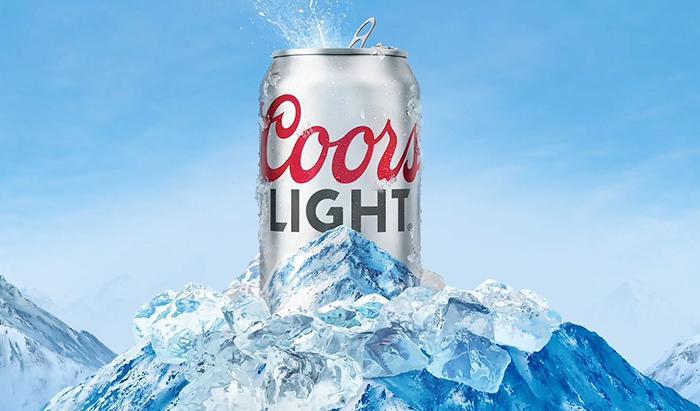
Clean whites, light blues, and icy silvers are the territory of lagers and pilsners. They communicate crispness, refreshment, and cold clarity. Coors Light’s mountain-blue palette is a textbook example of this principle at work in mass-market beer advertising.
Deep greens carry associations with nature, craft, and heritage, making them popular for craft ales and session beers positioned as premium products with environmental or local values.
The 60/30/10 Color Rule
Professional designers follow the 60/30/10 rule for color balance: 60% of the design uses your dominant background color, 30% is a secondary supporting color, and 10% is an accent color used for highlights and calls to action. This prevents the visual chaos that happens when someone loads seven competing colors onto a single poster.
Analogous color schemes (colors neighboring each other on the color wheel) create harmony and warmth, perfect for craft brewery aesthetics. Complementary color schemes (colors directly opposite on the wheel) generate tension and energy, ideal for bold promotional posters advertising a limited release or event.
Limit your palette to two or three colors for the cleanest result. More than three and the design starts feeling cluttered and directionless.
Typography: The Voice of Your Beer Poster
Typography is where a beer poster’s personality lives. The font you choose does not just hold text. It tells the drinker who you are before they process a single word.
Matching Fonts to Brand Identity
Craft breweries lean heavily into custom display fonts, hand-lettered scripts, and distressed typefaces. These communicate artisanal quality, local character, and the sense that a human being made this product with their hands. Designers like Andy Hopkinson, who has worked with Stone and Wood and Mountain Culture, have used hand-drawn graffiti typography directly on beer cans precisely because that rawness communicates something about the brand that a clean digital font never could.
Traditional heritage brands (Budweiser, Pabst Blue Ribbon, Yuengling) prefer serif fonts that carry connotations of history, reliability, and Americana. The classic serifs used in vintage beer ads are still being copied and reinterpreted today, which is exactly why the TikTok trend gravitates toward them.
Modern breweries targeting younger demographics often choose clean sans-serif typefaces, bold and geometric, that feel at home next to a Spotify playlist or an art gallery wall.
The golden rule: never use more than two typefaces on a single poster. One for the headline, one for body text. Using three or more fonts creates visual noise that makes viewers look away rather than lean in.
Font Size Guidelines for Readability
Readability across a room depends entirely on font size. Here are the practical baselines:
- Legible from 6 feet away: use at least 30pt
- Legible from 10 feet away: use at least 48pt
- Legible from 12 feet away: use at least 60pt
- Legible from 14 feet away: use at least 72pt
For a standard bar poster, your headline should be 60 to 90pt, secondary information 36 to 48pt, and fine print no smaller than 24pt.
Product Photography: The Make-or-Break Element
Missing proper product photography kills most beer poster projects before they start. If you are creating a poster for a real product, whether it is your homebrew or a brewery client’s seasonal release, the beer bottle or can image needs clean lighting and enough resolution to scale without any pixelation.
What Makes Great Beer Product Photography
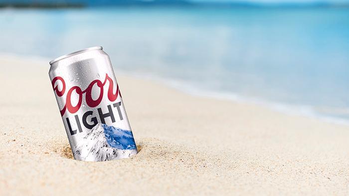
Lighting should ideally be studio-quality, using soft boxes or diffused light positioned to the side to capture the translucent quality of the beer inside the glass or bottle. Back-lighting creates the iconic glowing amber effect seen in professional beer ads. Condensation droplets on a cold bottle or can are among the most powerful visual triggers in beer marketing. They signal coldness, freshness, and immediate satisfaction.
File format matters enormously. PNG files preserve transparency, meaning you can place the bottle on any background without a white box appearing around it. JPEG files use lossy compression that creates visible artifacts and eliminates transparency, making them problematic for layered poster design.
For the TikTok personal beer poster, your own photo is the hero element. The best shots for this trend are summer lifestyle photos: beach scenes, backyard parties, rooftop gatherings. Bright natural light with a clear sky in the background gives you the most flexibility when editing.
Step-by-Step: How To Make a Beer Poster in Photoshop
This process covers a professional promotional poster in Photoshop. The same principles apply in Canva or Adobe Express, with some steps simplified.
Step One: Set Up the Canvas Correctly
Open Photoshop and create a new document. For a standard bar poster, set dimensions to 24×36 inches, 300 DPI, CMYK color mode. Name the file descriptively, for example BeerName_Poster_24x36_CMYK_v1.psd. This naming convention saves significant time when clients request revisions and prevents overwriting earlier versions.
Step Two: Build Your Background
Start with a solid background color pulled from your brand palette. Add subtle texture using fabric, canvas, or grain overlays at 20 to 40% opacity. This adds tactile depth without competing with the foreground. Apply a radial gradient centered where the product will sit, with the lightest point at center. This draws the eye naturally toward the product. Avoid harsh gradient transitions. Subtle shifts in saturation work far better than dramatic color jumps.
Step Three: Place and Refine the Product Image
Import your beer bottle or can photograph. Use Select Subject or the Pen Tool to cut it cleanly from its original background. Adjust exposure, contrast, and saturation to match the overall mood of your poster. A warm IPA poster calls for elevated warmth and saturation. A lager poster benefits from a cooler color temperature. Place the product at visual center or slightly below center, using the rule of thirds to give breathing room above and around it.
Step Four: Add Ingredient Icons and Supporting Imagery
Hop cones communicate IPA bitterness and aroma profiles to anyone who knows beer. Barley or wheat illustrations reference the malt backbone. Citrus slices, coffee beans, or vanilla pods illustrate flavor additions without requiring text to explain them. Keep icons simple. Overly detailed illustrations compete with your product photography rather than supporting it. Use repetition of small icons at 20 to 30% opacity to create texture and rhythm across empty space.
Step Five: Apply Typography Hierarchy
Your headline is the most important element after the product image. Place it above the product or in the upper third of the poster. The beer name should be the largest typographic element. The style (IPA, Stout, Lager, Sour) comes second, smaller and often in a contrasting weight. Supplementary information such as ABV, event date, venue, or price appears last at the smallest size.
Step Six: Logo Placement
Logos placed in top corners function as secondary branding. Logos placed at bottom center serve as official signatures, the classic beer ad convention used for decades. Scale logos to 15 to 20% of the poster width and always use the vector version (SVG or EPS) for sharp scaling at any size.
Step Seven: Color Grade the Entire Composition
Apply Hue/Saturation and Curves adjustment layers over the entire composition to unify the color temperature. This makes the product image, background, and typography feel like they belong together rather than being assembled from separate sources. Warm color grades suggest celebration, richness, and tradition. Cool grades signal refreshment and modernity.
Step Eight: Export for Print or Digital
For print: save as Photoshop PDF, CMYK, 300 DPI, no compression. Request a physical proof from the printer before the full run. Zoom to 100% and scan every element for blurry edges, misaligned layers, or font issues. Check that CMYK ink percentages do not exceed 300 to 320% total ink coverage, which is the maximum most commercial printers can handle.
For digital: export as JPEG at 90 to 100% quality, RGB, 72 DPI, resized to platform specifications before uploading.
How To Make a Beer Poster for TikTok Using PicsArt
Read More : How Long Is Beer Pong Table Updated 07/2026
For the viral social media version, the process is considerably faster and requires zero design background.
The PicsArt Method
Download and open PicsArt on your phone. Tap the plus (+) button to start a new project and import your best summer photo. Tap Sticker, type “beer” into the search bar, and select the brand you want. Popular choices include Corona Extra, Heineken, Coors Light, and Budweiser. Position the beer logo or bottle so it partially overlaps your image, creating depth. Tap the eraser icon and carefully brush away the parts of the sticker covering your face or body, creating the illusion that you are inside the advertisement. Layer in additional effects, filters, or text. Export and post with the hashtag #beerposter or #beerposterchallenge.
Using Kapwing Templates
Kapwing streamlines this process by providing pre-built templates for Miller Lite, Coors Light, Budweiser, Michelob Ultra, Busch Light, and Corona. Open the template for your chosen brand, replace the example background photo with your own image using the Replace button, reposition the beer logo layer so it sits where you want it, and use the Erase tool to clean up the foreground layer. For a brand not included in the templates, delete the original logo, use the Images tool to search for any beer brand logo you want, and build from there. Export, download, and share.
Design Styles for Every Occasion
Different occasions and aesthetics call for completely different approaches. Choosing the right style before you open your design tool focuses your creative decisions and prevents the unfocused hybrid that results from trying to do everything at once.
Vintage and Retro
The vintage beer poster is one of the most beloved styles in American design. Warm color palettes, distressed textures, hand-lettered or serif typography, and illustrations of agricultural ingredients create a sense of heritage and craft. The TikTok beer poster trend embraced this style heavily. Warm colorations, classic brand logos, and old-school graphic conventions give even a smartphone photo the nostalgic, timeless quality of a 1950s advertisement.
Minimalist Modern
Clean backgrounds, bold sans-serif fonts, and a single strong product photograph define the minimalist approach. This aesthetic skews younger and is popular with premium craft breweries targeting urban markets. No clutter. No fluff. One image. One message. Consumer sentiment data shows that Corona’s minimalist poster aesthetic has a satisfaction rating of 4.7 out of 5 among collectors and beer enthusiasts, indicating that less truly is more in this context.
Event and Seasonal
Oktoberfest posters lean into deep greens, reds, and Bavarian folk motifs. St. Patrick’s Day posters go emerald and gold. Summer happy hour posters use bright, saturated colors and photography of cold beer in warm sunlight. Using Canva’s search filters for terms like “Oktoberfest” or “St. Patrick’s Day” instantly surfaces dozens of relevant templates ready for customization.
Funny and Personalized
The humor style is one of the most shareable formats in the social media era. Users add quirky captions, awkward selfies, or their pets alongside polished beer branding. The contrast between advertising aesthetics and genuinely chaotic personal content creates something deeply relatable. This style proved that you do not need to take beer poster design seriously to make something that goes viral and earns hundreds of thousands of likes.
Beer Poster Ideas by Occasion
| Occasion | Color Palette | Style | Key Visual Element |
|---|---|---|---|
| Oktoberfest | Deep green, red, gold | Traditional Bavarian | Steins, pretzels, folk patterns |
| St. Patrick’s Day | Emerald green, gold | Festive illustration | Shamrocks, pints of stout |
| Summer Happy Hour | Bright citrus, sky blue | Photography-forward | Cold beer, pool, sunshine |
| Father’s Day | Amber, navy, kraft | Vintage heritage | Bottle close-up, serif type |
| Craft Beer Release | Earthy tones, illustration | Artisanal, hand-drawn | Hop cones, barley, brewery name |
| Sports Watch Party | Bold red or blue, high contrast | Bold typographic | Crowd imagery, pints |
| Holiday Party | Deep red, gold, dark green | Festive premium | Cocktails, fairy lights, toasts |
| Homebrew Showcase | Custom, personal | Playful or classic | Personal label, custom beer name |
Printing Your Beer Poster: What You Need to Know
Designing the poster is only half the work. Printing it correctly is where many people fall down.
Paper and Finish Options
Gloss finish brings out the richness of dark backgrounds and saturated colors. It works beautifully for vintage-style beer posters and anything with heavy photography. Matte finish reduces glare and is ideal for craft brewery aesthetics where a more understated, tactile feel is desired. Satin (semi-gloss) offers a middle ground and is the most forgiving option if you are uncertain which direction to go.
Where to Print
- Local print shops (FedEx Office, Staples): fast turnaround, good for single copies and proofs
- Walmart photo center: extremely affordable for simple formats, great for personal beer posters under $20
- Online services (Vistaprint, Moo, Printingforless): better paper quality options, CMYK-accurate results, better for volume
- Specialty large-format printers: best for commercial taproom display work at 24×36 inches and above
For any professional print job, always request a physical proof before committing to a full run. Colors on a commercial press will not match your screen exactly, but a proof catches major shifts before they become an expensive mistake.
Using Pantone Colors
For branded brewery work where color consistency is critical across multiple print runs or vendors, specify Pantone (PMS) colors in addition to CMYK values. Pantone is a standardized color-matching system that guarantees your amber will look identical whether printed in Chicago or Los Angeles. Always reference your brand’s Pantone codes when briefing any printer.
Common Beer Poster Mistakes (And How to Avoid Them)
Even seasoned designers fall into these traps repeatedly.
Using too many fonts. Limiting yourself to two typefaces is not a creative restriction. It is the foundation of visual clarity. Every additional font introduces noise that competes for the viewer’s attention.
Ignoring white space. A poster crammed with information communicates nothing effectively. White space (also called negative space) is not empty. It is an active design tool that directs the eye and allows important elements to breathe.
Low-resolution product images. Stretching a 72 DPI image to print dimensions creates visible pixelation. Always source product photography at the final print size or larger.
Designing in RGB for print. Converting RGB to CMYK at the last minute causes unpredictable, often ugly color shifts. Set the correct color mode at the very start of your project.
Overusing drop shadows and effects. Every effect should earn its presence in the design. When every element carries a drop shadow, nothing stands out.
Skipping the proof. Reviewing the design at 100% zoom before sending to print catches problems invisible at smaller sizes. CMYK ink percentages should not exceed 300 to 320% total ink coverage for most commercial printers.
AI-Powered Beer Poster Generation
The newest frontier in beer poster creation requires zero design skills whatsoever. AI beer poster generators like RunComfy’s tool allow you to type a text description and optionally combine it with up to three reference images, receiving a fully realized beer poster design in seconds. These tools are ideal for rapid concept generation, getting inspiration when you are stuck, or creating personalized social media content without any design background. Most offer free daily generations without requiring an account.
For homebrewers who want a custom label or poster for their latest batch, an AI generator paired with Canva for text editing can produce a genuinely impressive result in under 15 minutes and cost nothing. Even platforms like Pixazo have introduced dedicated AI Beer Poster Makers that allow you to choose from an array of artistic styles and customize with a few clicks, no design experience required.
The Cultural Weight Behind a Cold Beer Ad
It is worth taking a moment to appreciate why the beer poster resonates so deeply with Americans. Beer advertising has been woven into the cultural fabric of the country for over a century. Women appeared in beer ads as far back as the 1930s, with brands like Acme Beer marketing their product as “non-fattening” compared to competitors. Celebrity endorsements date to the golden age of Hollywood, with MGM film stars lending their faces to lager brands. Budweiser even reimagined its 1950s-era ads for International Women’s Day in 2019, promoting gender equality while acknowledging the sometimes complicated history of how women have been represented in beer advertising.
The visual language of beer advertising, summer landscapes, golden light, ice-cold bottles, and the suggestion of effortless pleasure, has been refined across generations. When someone creates a beer poster today, whether it is a TikTok joke or a serious commercial project, they are drawing on that entire tradition. The design choices you make connect to a century of visual storytelling.
That amber background is not just a color choice. It is a reference to every summer sunset and every sweating bottle of something cold and perfect that came before it.
Your Beer Poster Is an Invitation
A truly great beer poster does not describe a product. It extends an invitation. Come here. Sit down. You belong in this moment. Every element of the design, the product placement, the color temperature, the font weight, the texture, the tagline, works together to issue that invitation in three seconds or less, the window before a viewer’s eye moves on.
So the next time you stand in your favorite taproom and study the poster on the wall, notice what it is actually doing. Notice the way the background color makes the product glow. Notice the font choice, and what era and attitude it conjures. Notice the white space that gives the whole thing room to breathe.
Then go home, crack open whatever you are drinking tonight, and make your own. Because the best beer poster is the one that reflects your version of that moment: your summer, your friends, your favorite pour, your story told in amber and gold.
Sources: https://chesbrewco.com
Category: Beer